It started as curiosity. What do GPS tracks say about the ratio of uphill and downhill hiking speeds?
It became graphs of all the hikes I’ve done since ’07 showing speed against the hike’s angle of slope.
Here are the average absolute slope angles on a per-track basis. If the dot’s high up, the hike was on a steep hill.
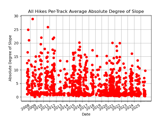
Yes, those high tracks before 2012 were steep. Mailbox Peak, Guye Peak, and Wagonwheel Lake, for example. Good stuff. A week after wobbling to the car below Wagonwheel Lake, I was merrily springing up the stairs at home.
Notice the laid back hiking in ’12 and ’13. … Sigh. … 2012 was a lost summer – lost working too much while the sun shone outside. The 2013 hiking season was spent in chemo-land. The cluster of flat hikes at the end of 2013 was me getting strength back by looping Maplewood.
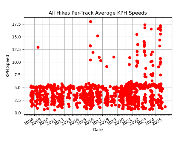
Here are the average track speeds. It shows Scott’s bike a few times in the last couple years. The cluster of 5 kph tracks at the end of 2013 are the flat, Maplewood strolls mentioned above.
One of the slow speed hikes in late 2014 was up Adams Peak (Sri Pada) in Sri Lanka. Here are how the point-speeds on that walk distribute as a function of slope angle.
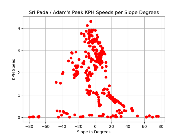
That hike’s graph really shows the difference between down and up-hill speeds. I “ran” down a lot, but you don’t enthusiastically race straight down 5000 concrete stairs.
Here’s the same sort of thing for Wagonwheel Lake:
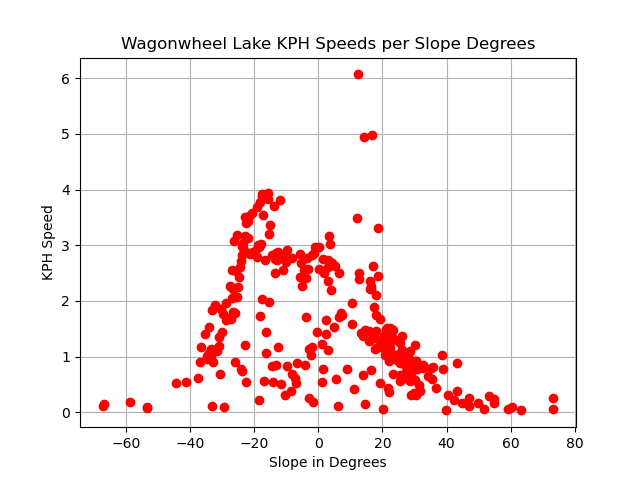
As noted below, GPS points are noisy, any way you spin ’em. But the overall fit is OK.
Here are all the tracks’ points graphed as a function of slope.
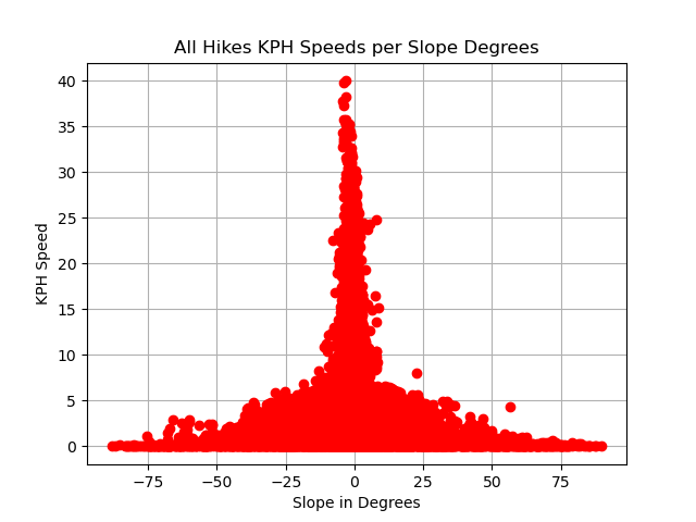
Bike ride speeds tower above the others. The near-level-ground points in the middle of the graph are, in fact, skewed to the left – downhill – to negative slope angles. They don’t look so in this graph for tech reasons.
Finally, here is a PDF containing scalable versions of the all-hike graphs above.
Note: These graphs were made from “hikified” GPS tracks. Points in a line between two points are eliminated by the “hikify” logic. That logic also combines GPS points near each other. But, even at a filtered, combined point scale, GPS data is noisy.
Python 2.7 scripts in the usual state of repair: