Technical Details of the AKAI MPKmini Professional MIDI Keyboard

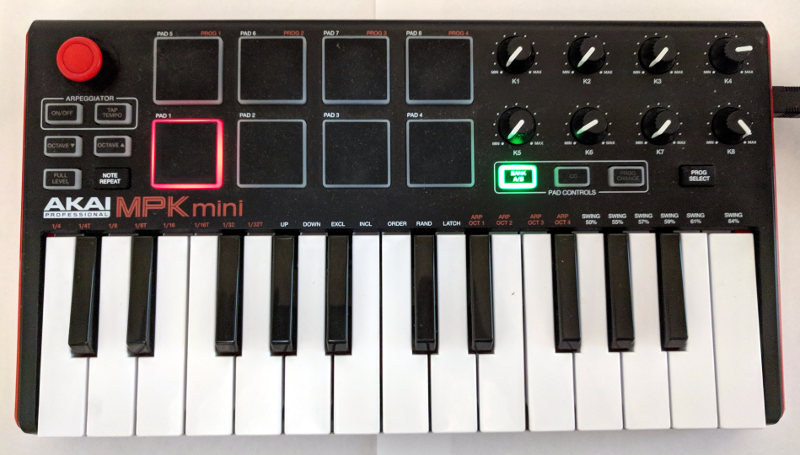
This year I impulse-bought an AKAI MPK mini Pro 2-octave MIDI device.

AIKI MPKmini Pro

And found that, apparently, if you want to do anything with Midi music, you buy a Mac.

Well, I’ve always found Mac/Apple UI to be unusable, so that’s out.

Anyway, it turned out to be easy to get MIDI messages from a USB device to a Python program using python-mido. And, after some dithering, creating sound from Midi was do-able. I tweaked one of several variants of fluidsynth.py on GitHub. The actual instruments came from various SoundFont files downloaded from the magical Internet. My favorite of the 48 I have is gigabyte-sized Compifont_13082016.sf2.

Re-inventing the wheel can be entertaining.

In the course of playing with the AKAI I made the following notes about the AKAI’s sysex and light control logic. Make of them what you will.

"""

Some things found about the Akai Pro Mini using (after plugging the device alone in to USB bus 3 - the near plug on the front panel of spring):
    sudo modprobe usbmon                        # makes the /dev/usb/usbmon[0-7] devices
    sudo cat /sys/kernel/debug/usb/usbmon/3u    # doesn't print more than 24 real data bytes at a time (32 bytes packaged in 8 4-byte words)

    Note: Each 4 bytes has a 04 as the 1st byte and a 07 instead of 04 on the last 3 real data bytes.

Or:
    sudo tcpdump -i usbmon3 -x

Note:       https://github.com/mungewell/mpd-utils/blob/master/sysex/sysex_mk2.md   has some sysex reverse-eng info for the device
Note:       private/akai/APC40Mk2_Communications_Protocol_v1.2.pdf                  for a similar device (some note on the web said this MPKmini doesn't have such a doc)

MPK Mini sysex from device

sysex data=(
71,         Akai device     71==0x47
0,          More Akai dev?                      (which particular device? - 0x7f is broadcast, apparently, and 0x7e is non-real-time?)
38,         Akai model      38==0x26
103,        sysex function  103|0x67 is (prog_memory below: 0..4=RAM|prog1..4) coming from device.
                            102|0x66 requests a program (prog_memory below: 0..4=RAM|prog1..4) from device.
                            100|0x64 puts program to device.
                             96|0x60 requests the knob positions (see the code for example).
                             97|0x61 is knob positions from the device.
0,          hi-7-bits of how many bytes
109,        how many more bytes there are or are meant to be if the device didn't have bugs?

0,          prog memory     0=RAM 1=prog1 2..4=prog2..4

0,          pad channel     0..15

0,          key channel     0..15
4,          key octave      0..8    4 + octave      (changes LEDs)

0,          arp             off=0 on=1              (changes LED)
0,          arp mode        0..5
0,          arp time div    0..7
0,          arp clock       internal=0 external=1
0,          arp latch       on=1    off=0
0,          arp swing       0..5    50%|55%|57%|59%|61%|64%
3,          arp tempo taps  2..4
1,          hi bit          arp tempo  30..240
0,          lo 7 bits       arp tempo  30..240
0,          arp octave 0..3 (displayed on-screen in Akai setup program and on device's keys in red as 1..4)

0,          0=pitchbend     1=cc1 2=cc2
0,          cc1|cc2-down    0..127
0,              cc2-up      0..127
2,          cc2
65,         cc2-down 65
64,         cc2-up   64

48,         note_on note when not in CC or PC mode
0,          cc
0,          pc
1,          momentary=0 toggle=1
49,1,1,1,
50,2,2,1,
51,3,3,1,
52,4,4,1,
53,5,5,1,
54,6,6,1,
55,7,7,1,
56,8,8,1,
57,9,9,1,
58,10,10,1,
59,11,11,1,
60,12,12,1,
61,13,13,1,
62,14,14,1,
63,15,15,1,

0,      cc
0,      lo
127,    hi
1,0,127,
2,0,127,
3,0,127,
4,0,127,
5,0,127,
6,0,127,
7,0,127,

12          0..24   12 + transpose of -12..12
)


"""

#
#
#   If the device is in the right state, apparently any channel 0 note_on (non-127?) will turn off the PROG_CHANGE light until some other note_on messages are sent or something.
#   led_lite values:
#       0..2    At start-up most recent is Prog Change - it turns off/on.
#       3       Apr On/Off
#       4       Tap_tempo changes only if human has turned off Arp
#       5       Octave down
#       6       Octave up
#       7       Full level
#       8       ?
#       9..16   Pads
#       17..24  Most recently used lite.
#       25      Bank A/B if Green, off goes to off or red, whichever it was last set by the human. Human-set red cannot be turned off.
#       26      CC
#       27      Prog Change
#       Other led_lite values are just weird. Most recent lite changed or something is affected.
#   The lites don't affect the meaning of the button. The button must be hand-toggled from its logical state to get to a state that matches the lite after the lite is turned off.
#
#   The 127-ness came from a comment at: https://cycling74.com/forums/akai-mpk-mini-send-get-signals-to-light-buttons
#
#
AKAI_MPK_MINI_LITES   = [
    [ 3,    "Arp",          ],
    [ 4,    "Tap_Tempo",    ],
    [ 5,    "Oct_down",     ],
    [ 6,    "Oct_up",       ],
    [ 7,    "Full_level",   ],
    [ 9,    "Pad_1",        ],
    [ 10,   "Pad_2",        ],
    [ 11,   "Pad_3"         ],
    [ 12,   "Pad_4",        ],
    [ 13,   "Pad_5",        ],
    [ 14,   "Pad_6",        ],
    [ 15,   "Pad_7",        ],
    [ 16,   "Pad_8",        ],
    [ 25,   "Bank_A/B",     ],
    [ 26,   "CC",           ],
    [ 27,   "Prog_change",  ],
                        ]


LG is the Good Guy

A few years ago I got an LG Nexus 5X phone through a new Google Fi account.

The Nexus5X has a camera app that (probably) eats RAM often to the point of crashing the system and/or killing the two GPS logging apps I always have running. But the camera app does HDR well and has great panorama logic. The camera app pretty much displaced an old Canon A650 IS for my picture taking.

And then, some months ago, my Nexus 5X went in to the infamous “boot loop”. The Nexus 5X would not boot. After a lot of Google time and whatnot, I bought a Motorola Power G. And found a solid, reliable camera app. That reliably took lousy pictures. Bizarre panoramas. Ugly HDR. Thank God for the decade old, long-in-the-tooth Canon.

Cue the trumpets: A couple of months ago I accidentally found the original Nexus5X box. Which had the phone’s IMEI number. Which allowed me to call LG’s support number. Who told me that LG would fix a boot-loop phone for free. So, that phone call set up an email from LG a couple of weeks later. The email had a FedEx shipping label. Which I drove, with the phone, to the Issaquah FedEx office. And a couple/three weeks later I got a working Nexus5X.

Early in personal computer history, it was common practice to advertise a product idea as a real product. Enough pre-orders drove the actual product creation and manufacture. Then IBM came out with their PC. The PC was already engineered and shipping. But IBM goofed. All shipped PCs needed a fix. IBM fixed them. IBM ate the cost. That sealed the PC deal. IBM showed that they could be trusted. They stood behind their product. That was a massive change in the personal computer world of the time.

With my Nexus5X, I found LG stands behind their product.

Expect / Want / Need — Standard American Politician

Years ago I learned a sequence to follow when giving things to people.

First, you must give a person what they expect.
Then you can give them what they want.
Finally, you can give them what they need.

Sadly, I almost always stumble on expect, but the few times I’ve followed this script have been magical experiences. The sequence works!

So, back in 2016 I watched the third Trump/Hillary debate and noticed something.

Hillary fluently spoke a dialect of English I dubbed “Standard American Politician” (SAP).

Trump did not.

What is SAP?

Listen to the sound of, “That’s an important issue, Ralph. We have laid out a comprehensive plan to move America forward on that issue.

Notice it’s not just any old plan, it’s a comprehensive plan. SAP has a unique set of buzzwords with idiosyncratic meanings.

Notice the politician has told you this “issue” is, um, not a priority, but they are ready to trot something out in case the issue ever bubbles up during a campaign. You understand that meaning because you understand SAP.

SAP allows a politician to state things in a way that makes it difficult for others to miss-spin meaning.

And SAP also makes it easy to, ah, add nuance when the politician’s position “evolves”.

Is that the end of it?

No, the sequence of expect/want/need comes in play here.

Most people expect politicians to speak Standard American English. The higher the office, the more fluent the politician. If a politician does not speak SAP, then expect-people will miss a beat when they first hear the politician, but will get the message that this politician is running an outsider campaign. So. … Nothing of note.

Many people want their politicians to speak SAP. This makes sense. SAP has evolved to match its use. Meaning is more easily gleaned from SAP words. Etc. If a politician does not speak SAP, want-people will miss a beat, but will adjust as they might adjust to someone who speaks non-native English.

And, finally, some people need their politicians to speak SAP.

With that observation, in an instant, I understood a common, gut-level reaction to Trump.

Two New Earth-Like Planets Discovered

While the rest of the world was sleeping, I have been building a space ship. This autonomous ship has recently explored space near our Sun at a distance of Earth’s orbit. This exploration has been a remarkable success.

The ship has discovered two new planets! These planets orbit our Sun in exactly Earth’s orbit. And, it appears they can host life.

You may be skeptical of these claims. That’s understandable. But, pictures don’t lie. I dub the first planet discovered, Oceania. Behold:

The newly discovered planet, Oceania.

Oceania is an ideal planet for fish.

I dub the other newly discovered planet, Landia. Terrestrial animals and plants will find Landia an ideal planet, as you can see clearly:

The newly discovered planet, Landia.

These discoveries promise to change the course of not only history, but of life on Earth, itself.

Covid 19 Does Not Specially Target Old Folks

In my mind’s eye, I thought of Covid 19 as specially targeting the old.

We all know stories of nursing homes packed with sick old folks. But nursing home residents succumb to any sickness more easily than, say, high school kids.

So, is Covid 19 going after old folks in particular, or is Covid 19 just one more way to be killed?

Let’s find out.

The CDC has data for all deaths in the US by week and by age groups. Let’s graph that data in a stacked area graph.

This stacked area graph shows horizontal bands, one for each of several age groups. Thick bands have higher numbers of deaths, thin, lower.

If Covid 19 specially affects old folks, then the bands for older age groups should get thicker during March and April when most US Covid 19 deaths happened.

Note: The unlabeled age groups in this graph are:

    45-54 years
    35-44 years
    25-34 years
    15-24 years
    5-14 years
    1-4 years
    Under 1 year.

A consistent quarter of all deaths are people 85 and up. A little less are in the 75 to 85 age group. And so on.

WARNING! THE SLOPE ON THE RIGHT IS CREATED FROM MISSING DATA. In the US, it takes time for notifications of deaths to get to the CDC. Raw numbers for recent weeks are always low. One thing this graph shows, therefore, is that death reports for 85+ people get to the CDC faster than others.

This graph makes it appear that Covid 19 really has no differential affect on different age groups.

But, is it misleading?

Have you noticed graphs that purport to show information about Covid 19 almost always cut off shortly before Covid 19 was a factor in the US? This one does, too. Uh, huh, Robinson, remove the baseline context from your graph, you sneaky devil, you. Well, is that a problem here?

Well, the CDC also has death-by-age information going back to the beginning of 2015. Slightly different age groups as in the graph above, but good enough for a picture. Let’s look:

The unlabeled age groups are:

    25-44 years
    Under 25 years.

Judging by this graph, if any age group has been hit harder by Covid 19, it’s the 45-64 year group! But look at the first, zoomed-in graph before jumping to that conclusion.

If you squint, you can see that 85+ people tend to die slightly more often in the winter than in the summer. There tends to be a time – anywhere from October out to March – when 85+ people are hit the hardest. That’s likely to be the various flu seasons doing what they do. They come early. They come late. They come once or twice or not at all. They vary.

I do not know what’s going on with the ramp-up on the left – early 2015. Looks like a particularly bad season to be 85+. But, it’s on the edge of the graph, so …?

OK. That’s about it. I was thinking wrong. There’s nothing special about how Covid 19 affects old folks.

…..

JSON data behind the graphs (Do not hit these URLs unless you know what you are doing. Your browser may not handle them well.):

JSON 2020 Feb thru mid Aug weekly US deaths by age group

JSON 2015-2020 weekly US death counts – by state and age group – 60 megabytes

A new Kinsa fever movie

Here is another movie generated by my Kinsa fever data display program.

This video uses color to show which US counties have similar Kinsa fever thermometer statistics. This particular video colors counties with recent (previous 15 days) higher-than-other-county-fever-percentages in red tones, less recent high percentages in green tones, and high percentages older than 45 days in blue.

Watch red to see how fever moves around the country over time. Watch for blue to see counties that have had fever, but not for a while. Green counties were feverish around a month before the end date.

During the video, the end date runs from mid-March to August 7th.

Where Kinsa says it’s getting hot

Here is the current US map with green showing the highest percentage of feverish people in March and April, blue showing May, and red showing June so far, to theĀ 8th.

Notice California (e.g. Alameda County)

and Florida (e.g. Pasco County)

seem to be heating up in May/June (red and blue – orange), and western Utah (e.g. Beaver County)

has come alive in the last, red week – June, that is. I wonder if anything is going on in these places.

By way of contrast, consider most of Texas (e.g. Nolan County)

which was particularly feverish (compared to other places in the US) only in May. That drop-off in Nolan County, Texas is peculiar, too. Neighboring counties have a similar, but not so dramatic drop-off. Probably some peculiarity of data processing. … Or is it? Dum, dum, dum, dummm. Suspense!

Seeing Kinsa thermometer time-period fever profile similarities.

This Corona Virus thing is, ignoring dead people, a lot of fun.

Why?

Well, because it’s so interesting. The progression of the disease is interesting, the reactions to the disease are interesting, and speculations about the post-virus future are interesting.

One interesting thing is the quantity of blather from the babble-world. Where are exceptions to misstatements, lies, confusion, and overall silliness?

One exception seems to be a company named Kinsa. They sell an Internet connected fever thermometer. $30 and $50. Currently sold out.

But, talk about perfect timing: Kinsa has data for much of the US showing when people were, and are, running fevers. Their data correlates pretty closely to flu season.

So, come Covid19, they moved fast and created https://healthweather.us. This web page shows in color and graphically which counties in the US have been affected by fevers and when, post February 16th.

The good, the bad, the ugly:

The Good: A couple minutes in the Firefox Web Developer says the data underneath the web page is remarkably clean and accessible. (OK, they’ve made breaking changes to the data a couple times in the last few days, but life is tough. Boo. Hoo.)

The Bad: Starting Feb 16? Why not Nov 1, 2019? I know why. But why?

The Ugly: Sorry, Tuco. You’re written out of this script. It’s a pretty web page.

Can the web page and data reveal outbreaks of fever in near real time? Kinsa sure hopes so.

As it turns out, the famously big US Covid19 outbreak (NY city) does show up in Kinsa’s data.

But, it remains to be seen what happens over the next few weeks as people wander out of stay-at-home. Thermometers don’t inherently pay attention to political spin, and don’t inherently serve to confuse. So, I’m rooting for Kinsa.

Now, this is all very nice, but what does it lead to?

Well, look at the orange/red line in the NY County image above. Notice its shape – its profile. Call that shape the “fever profile”.

I was clicking around some counties on the web page and noticed an odd thing: Most counties had a fever profile from February to May that looked like neighboring counties. Like, say, county A had a spike of fevers around March 17th, and so did bordering counties B and C. Not counties two states over, though.

Fair enough.

But, sometimes there seemed to be sharp transitions between one county and the next with respect to their curves. Maybe my imagination. Maybe not.

I wanted to see the whole country’s county-time fever profile similarities at a glance. If two counties had a similar fever profile/curve from February through today, the two counties should look similar in a picture. And if their fever profiles were different, they should look different.

So, I whipped up a program to color counties based on the total fever-percentage-of-people numbers in 3 bands of time. E.g. Feb 16 to the end of February. The first half of March. And the third band for mid-March to the present. Then the larger the totals a county has in fever percentages in each band, the brighter a color is. The first band is red. The second, green. And the last, blue.

And, here is a picture of the US with counties colored based on fever percentage profiles as of today:

It looks like if you really didn’t want a fever, you should have been in a dark area – Arizona, New Mexico, or the Knoxville Tennessee area. That latter area is quite the surprise.

And if you like Covid19, you wanted to be in the bright blue (mid-March and later) Florida or the New York City areas. Don’t forget to be old!

If you want the flu (in red February), go north-central (ND, WI, MN, northern MI, … or … Canada?).

If you do like your body hot, go to where the colors are bright: downstate Illinois, Indiana, western Kentucky, and Missouri. Maybe Ohio. Or maybe California! Though in California a hot body could be taken two ways.

Here is a picture based on the fever percentages minus what Kinsa expected them to be given historical trends:

Bright New York is pretty clearly where the unusual fever has been. And I love the West Virginia hole in the picture. Examining the (Fever Expected) profile for a county there:

shows they dodged the flu.

Another bright spot I didn’t expect was downstate Illinois. The bright purple says they probably had a bit more flu and Covid19 than Kinsa‘s expectations. Or something.

You want movies? You got ’em:

Percentages of people running a fever stepping “today” from February through May:

Fever percentages minus what Kinsa expected:

All in all, it’s been a fun program to write. It shows the fever profile of the county your mouse hovers over so you can quickly see the profiles of lots of counties in a geographical area. I’ve found that handy and kinda informative.