
Over the last few months I’ve had reason to watch my heartbeat using information from a CMS-50D Pulse Oxi device. When all is normal, a display from a web app I’ve written to show the Pulse Oxi’s output shows something like this:
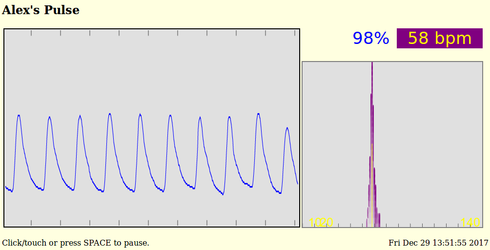
All well and good.
But, currently, if I put my heart under a bit of load, it doesn’t just speed up as it should. Instead, it does something like this:
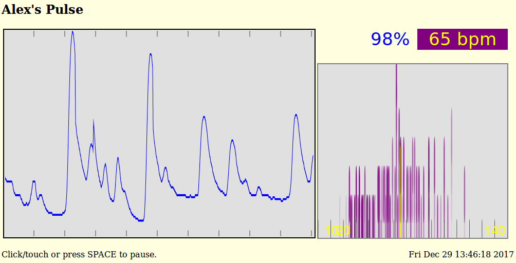
OK. What is “this”?
“This” is the pattern of 1 over-sized beat followed by 3 to 5 fast, weak beats followed by a delay of a beat of so. This is an unpleasant, very breathless pattern.
The thing is, this pattern isn’t all that’s going on. And, it raises the question, “What about a longer view?” The waveform display shows about 10 seconds of heartbeat. That’s great for general use, but you need to watch the display carefully to see trends and changes that happen over 10’s of seconds, let alone minutes.
A normal waveform display is also unsatisfactory in another way: The beats-per-minute number lags. In practice, BPM displays tend to be averages over 15 or more seconds. Fine for when all is well, but easily misleading when not.
So, examine the smaller graph in each of those two screen shots.
It shows a histogram of the last 120 peak-to-peak durations in beats per minute. Both the low and high peaks are counted, so this histogram shows the last 60 heart beats. The first graph above shows each half-beat has been plus or minus 5 or so BPM of the average heart rate. Normal.
Histogram details:
Tall lines show where many peak-to-peak durations have been at a single heart rate.
Short lines show heart beats of rarely seen durations.
Each peak-to-peak half-beat in the histogram is given a short line segment. Fully colored segments are recent beats. Faded segments are older beats. Segments are stacked in each beat-per-minute “bin”, oldest first, to make the histogram.
Ticks are painted at 10 BPM intervals along the bottom.
The yellow line marks the current, average heart rate. It is usually close to the tallest area of the histogram.
The second graph above shows when the heart does not beat consistently – misses or adds beats.
This histogram says, “Look carefully at this heart.”
Over time, you can watch a heart go in and out of sync. And it’s fun to watch the heart speed up and slow down, what with the columns marching back and forth on the histogram.
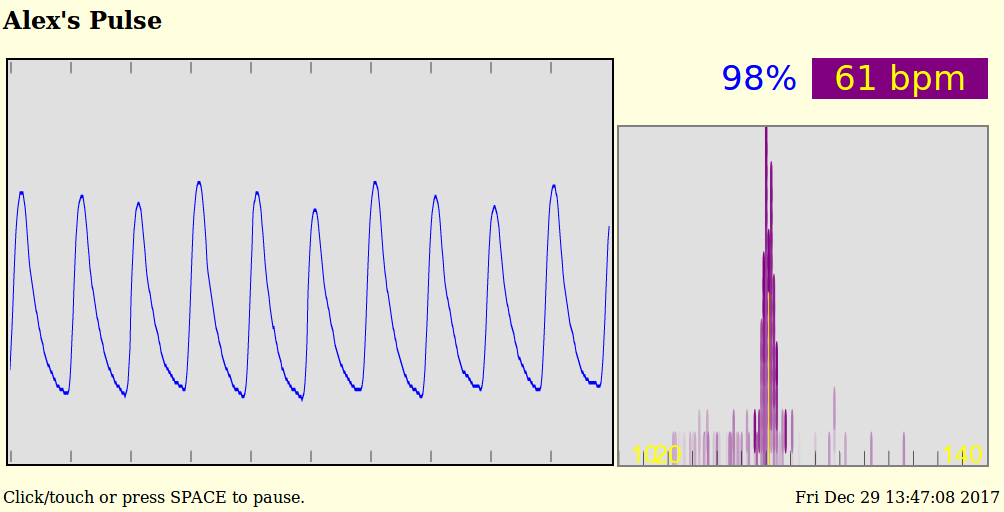
Here is a screen shot of when the heart beat was bad, but is now looking good:
Anyway, it’s been amusing to play with this stuff. And such a FIFO histogram could certainly be used in other applications.
A real-time display of either my current heart beat or a random, historical recording is at Alex’s Pulse – if the special, heartbeat server is running … which it rarely is, given the bandwidth this server consumes.