Here is the current US map with green showing the highest percentage of feverish people in March and April, blue showing May, and red showing June so far, to the 8th.
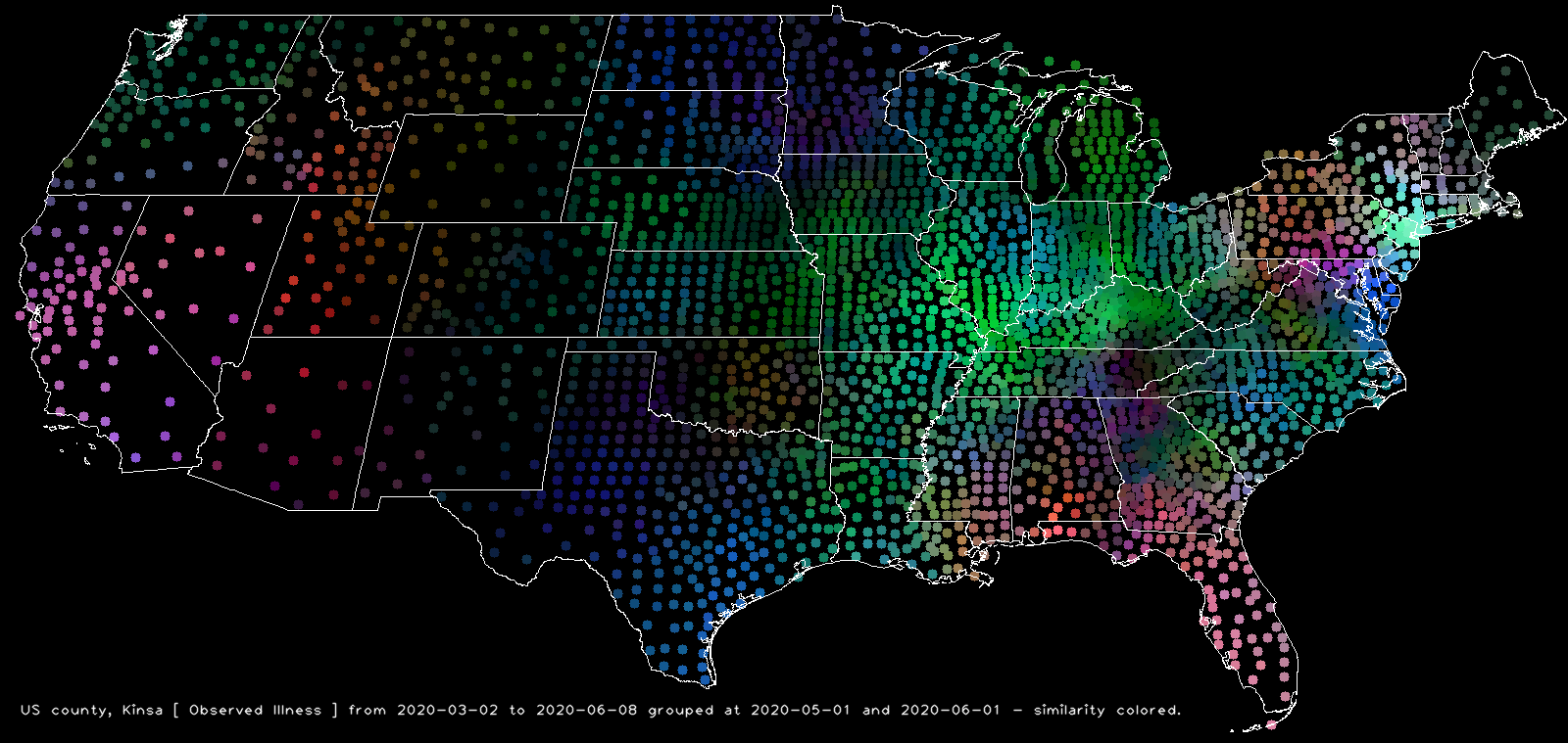
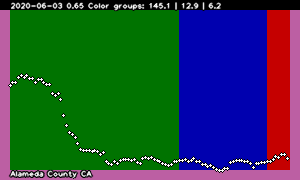
Notice California (e.g. Alameda County)
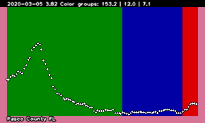
and Florida (e.g. Pasco County)
seem to be heating up in May/June (red and blue – orange), and western Utah (e.g. Beaver County)
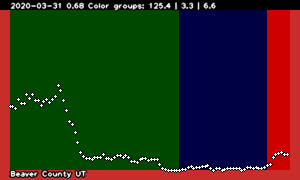
has come alive in the last, red week – June, that is. I wonder if anything is going on in these places.
By way of contrast, consider most of Texas (e.g. Nolan County)
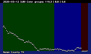
which was particularly feverish (compared to other places in the US) only in May. That drop-off in Nolan County, Texas is peculiar, too. Neighboring counties have a similar, but not so dramatic drop-off. Probably some peculiarity of data processing. … Or is it? Dum, dum, dum, dummm. Suspense!