While the rest of the world was sleeping, I have been building a space ship. This autonomous ship has recently explored space near our Sun at a distance of Earth’s orbit. This exploration has been a remarkable success.
The ship has discovered two new planets! These planets orbit our Sun in exactly Earth’s orbit. And, it appears they can host life.
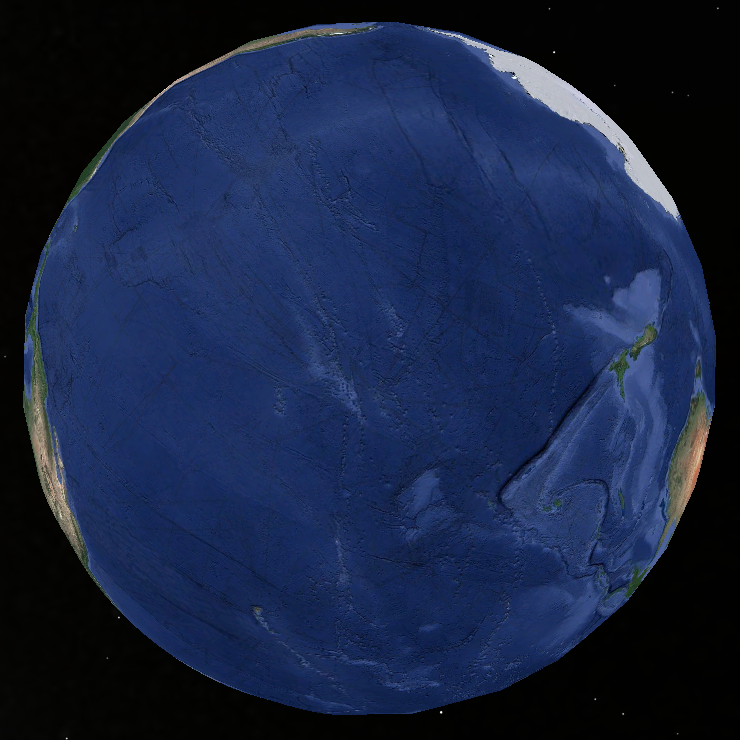
You may be skeptical of these claims. That’s understandable. But, pictures don’t lie. I dub the first planet discovered, Oceania. Behold:
Oceania is an ideal planet for fish.
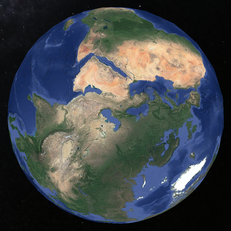
I dub the other newly discovered planet, Landia. Terrestrial animals and plants will find Landia an ideal planet, as you can see clearly:
These discoveries promise to change the course of not only history, but of life on Earth, itself.
In my mind’s eye, I thought of Covid 19 as specially targeting the old.
We all know stories of nursing homes packed with sick old folks. But nursing home residents succumb to any sickness more easily than, say, high school kids.
So, is Covid 19 going after old folks in particular, or is Covid 19 just one more way to be killed?
Let’s find out.
The CDC has data for all deaths in the US by week and by age groups. Let’s graph that data in a stacked area graph.
This stacked area graph shows horizontal bands, one for each of several age groups. Thick bands have higher numbers of deaths, thin, lower.
If Covid 19 specially affects old folks, then the bands for older age groups should get thicker during March and April when most US Covid 19 deaths happened.
Note: The unlabeled age groups in this graph are:
45-54 years
35-44 years
25-34 years
15-24 years
5-14 years
1-4 years
Under 1 year.
A consistent quarter of all deaths are people 85 and up. A little less are in the 75 to 85 age group. And so on.
WARNING! THE SLOPE ON THE RIGHT IS CREATED FROM MISSING DATA. In the US, it takes time for notifications of deaths to get to the CDC. Raw numbers for recent weeks are always low. One thing this graph shows, therefore, is that death reports for 85+ people get to the CDC faster than others.
This graph makes it appear that Covid 19 really has no differential affect on different age groups.
But, is it misleading?
Have you noticed graphs that purport to show information about Covid 19 almost always cut off shortly before Covid 19 was a factor in the US? This one does, too. Uh, huh, Robinson, remove the baseline context from your graph, you sneaky devil, you. Well, is that a problem here?
Well, the CDC also has death-by-age information going back to the beginning of 2015. Slightly different age groups as in the graph above, but good enough for a picture. Let’s look:
The unlabeled age groups are:
25-44 years
Under 25 years.
Judging by this graph, if any age group has been hit harder by Covid 19, it’s the 45-64 year group! But look at the first, zoomed-in graph before jumping to that conclusion.
If you squint, you can see that 85+ people tend to die slightly more often in the winter than in the summer. There tends to be a time – anywhere from October out to March – when 85+ people are hit the hardest. That’s likely to be the various flu seasons doing what they do. They come early. They come late. They come once or twice or not at all. They vary.
I do not know what’s going on with the ramp-up on the left – early 2015. Looks like a particularly bad season to be 85+. But, it’s on the edge of the graph, so …?
OK. That’s about it. I was thinking wrong. There’s nothing special about how Covid 19 affects old folks.
…..
JSON data behind the graphs (Do not hit these URLs unless you know what you are doing. Your browser may not handle them well.):
Here is another movie generated by my Kinsa fever data display program.
This video uses color to show which US counties have similar Kinsa fever thermometer statistics. This particular video colors counties with recent (previous 15 days) higher-than-other-county-fever-percentages in red tones, less recent high percentages in green tones, and high percentages older than 45 days in blue.
Watch red to see how fever moves around the country over time. Watch for blue to see counties that have had fever, but not for a while. Green counties were feverish around a month before the end date.
During the video, the end date runs from mid-March to August 7th.