
This Corona Virus thing is, ignoring dead people, a lot of fun.
Why?
Well, because it’s so interesting. The progression of the disease is interesting, the reactions to the disease are interesting, and speculations about the post-virus future are interesting.
One interesting thing is the quantity of blather from the babble-world. Where are exceptions to misstatements, lies, confusion, and overall silliness?
One exception seems to be a company named Kinsa. They sell an Internet connected fever thermometer. $30 and $50. Currently sold out.
But, talk about perfect timing: Kinsa has data for much of the US showing when people were, and are, running fevers. Their data correlates pretty closely to flu season.
So, come Covid19, they moved fast and created https://healthweather.us. This web page shows in color and graphically which counties in the US have been affected by fevers and when, post February 16th.
The good, the bad, the ugly:
The Good: A couple minutes in the Firefox Web Developer says the data underneath the web page is remarkably clean and accessible. (OK, they’ve made breaking changes to the data a couple times in the last few days, but life is tough. Boo. Hoo.)
The Bad: Starting Feb 16? Why not Nov 1, 2019? I know why. But why?
The Ugly: Sorry, Tuco. You’re written out of this script. It’s a pretty web page.
Can the web page and data reveal outbreaks of fever in near real time? Kinsa sure hopes so.
As it turns out, the famously big US Covid19 outbreak (NY city) does show up in Kinsa’s data.
But, it remains to be seen what happens over the next few weeks as people wander out of stay-at-home. Thermometers don’t inherently pay attention to political spin, and don’t inherently serve to confuse. So, I’m rooting for Kinsa.
Now, this is all very nice, but what does it lead to?
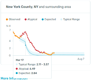
Well, look at the orange/red line in the NY County image above. Notice its shape – its profile. Call that shape the “fever profile”.
I was clicking around some counties on the web page and noticed an odd thing: Most counties had a fever profile from February to May that looked like neighboring counties. Like, say, county A had a spike of fevers around March 17th, and so did bordering counties B and C. Not counties two states over, though.
Fair enough.
But, sometimes there seemed to be sharp transitions between one county and the next with respect to their curves. Maybe my imagination. Maybe not.
I wanted to see the whole country’s county-time fever profile similarities at a glance. If two counties had a similar fever profile/curve from February through today, the two counties should look similar in a picture. And if their fever profiles were different, they should look different.
So, I whipped up a program to color counties based on the total fever-percentage-of-people numbers in 3 bands of time. E.g. Feb 16 to the end of February. The first half of March. And the third band for mid-March to the present. Then the larger the totals a county has in fever percentages in each band, the brighter a color is. The first band is red. The second, green. And the last, blue.
And, here is a picture of the US with counties colored based on fever percentage profiles as of today:
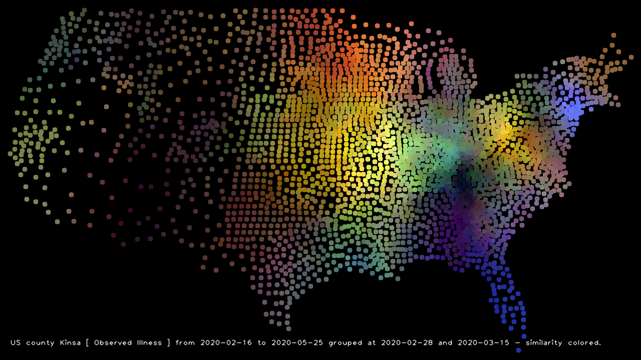
It looks like if you really didn’t want a fever, you should have been in a dark area – Arizona, New Mexico, or the Knoxville Tennessee area. That latter area is quite the surprise.
And if you like Covid19, you wanted to be in the bright blue (mid-March and later) Florida or the New York City areas. Don’t forget to be old!
If you want the flu (in red February), go north-central (ND, WI, MN, northern MI, … or … Canada?).
If you do like your body hot, go to where the colors are bright: downstate Illinois, Indiana, western Kentucky, and Missouri. Maybe Ohio. Or maybe California! Though in California a hot body could be taken two ways.
Here is a picture based on the fever percentages minus what Kinsa expected them to be given historical trends:
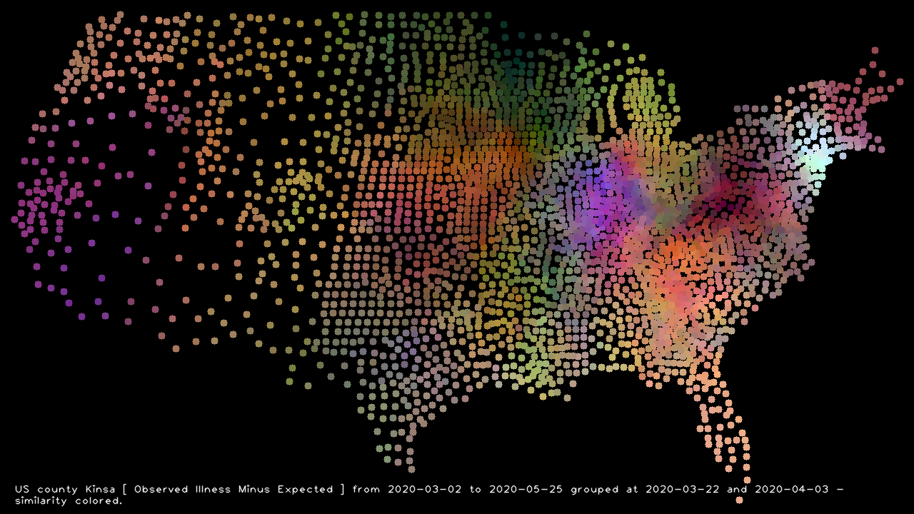
Bright New York is pretty clearly where the unusual fever has been. And I love the West Virginia hole in the picture. Examining the (Fever – Expected) profile for a county there:
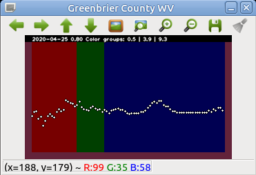
shows they dodged the flu.
Another bright spot I didn’t expect was downstate Illinois. The bright purple says they probably had a bit more flu and Covid19 than Kinsa‘s expectations. Or something.
You want movies? You got ’em:
Percentages of people running a fever stepping “today” from February through May:
Fever percentages minus what Kinsa expected:
All in all, it’s been a fun program to write. It shows the fever profile of the county your mouse hovers over so you can quickly see the profiles of lots of counties in a geographical area. I’ve found that handy and kinda informative.