Egalitarian Home Prices by State

Through a chain started at information aesthetics I happened upon a list of average and median home prices at Trulia.

First thing I wondered was, what’s the egalitarian factor?

Egalitarian factor?

Well, if the average price is way, way higher than the median price, you gotta figure that a few big numbers pull the average up, leaving the median as a better indicator of intuitive price. So, divide the median by the average and you have a number that goes up as the prices are more egalitarian. Don’t you?

Here are the results for today’s numbers:

State                Factor Average  Median

District Of Columbia   1.15  627362  720000
Iowa                   0.84  180103  150500
Nebraska               0.82  182592  150000
Wisconsin              0.82  241716  198000
Virginia               0.72  459543  329900
Washington             0.71  430707  305950
New Hampshire          0.70  371624  259500
Alaska                 0.67  315929  210700
Maryland               0.64  496329  320000
Ohio                   0.64  209321  133358
Minnesota              0.63  311943  196812
Kentucky               0.63  213286  134500
New Jersey             0.62  549482  342000
California             0.61  737454  452000
Nevada                 0.61  511755  309995
Illinois               0.59  386626  230000
Louisiana              0.59  279841  165000
Pennsylvania           0.59  305138  179900
Oregon                 0.59  416287  244900
Rhode Island           0.58  457480  265000
Delaware               0.56  426997  237000
Arkansas               0.55  222335  123000
Massachusetts          0.55  563596  310000
Texas                  0.55  265163  144900
Hawaii                 0.54  963770  522000
Arizona                0.54  459513  248229
Alabama                0.53  272234  145000
Georgia                0.53  323621  172000
New York               0.52  666838  350000
North Dakota           0.52  169117   88600
Florida                0.52  454882  236000
Oklahoma               0.51  206465  106000
Tennessee              0.51  261497  132500
Colorado               0.50  475910  240000
Michigan               0.50  246792  123192
Maine                  0.49  316602  155300
West Virginia          0.47  223331  105000
South Dakota           0.46  222642  101700
Vermont                0.42  377453  159355
North Carolina         0.41  330054  136149
Missouri               0.39  218186   84624
South Carolina         0.38  340385  129900
Connecticut            0.37  707500  260000
Mississippi            0.34  241566   82700
New Mexico             0.34  374934  127503
Montana                0.31  485158  151300
Indiana                0.31  204847   63655
Kansas                 0.30  197649   59044
Utah                   0.26  501207  129000
Wyoming                0.23  569040  130702
Idaho                  0.21  413325   85000

So, there is it, folks. DC is the most egalitarian “state”. In fact, you really must wonder about a place where the average is apparently pulled down by a few small numbers. Maybe there are a few houses in DC that people have paid a lot of money to get rid of. Not, mind you, the White House. Anyway, it’s interesting that the US government bureaucrat states of DC, Maryland, and Virgina are near the top of the list. Do such states disproportionately use apartments for low-end housing, taking the low numbers off the stats?

Some other interesting things in this list:

1) Washington state is pretty high on the list. Notice that I’ve ordered the list egalitarian-on-top.

2) The state names are colored by median price. Higher price, more red, less blue. And the reverse. I think that in a country where people are free to live where they want, it makes sense that the high end places are more “egalitarian”, even if there were not arithmetic reasons for this.

2) What’s with Kansas? Neighbors Iowa and Nebraska are similarly low priced and at the top of the list, but Kansas is at the bottom. Are a few rich people building houses in Kansas (can you say “Montana” or “Idaho”)?

Tracking a portfolio relative to the market

Well, I’ve built a web based front end to portfolio_track.py.

The idea is to track how well a stock portfolio is doing against a market average.

The front end uploads a text file and slowly presents an HTML listing of the output of portfolio_track.py.

For “the market”, the web front end uses the S&P 500, no fees and dividends.

Other market averages have, in the last couple of years, done slightly better than the S&P. But we’re talking a couple percent, maybe. Not enough to write home about.

This is all real fun, of course, since my own portfolio’s printout shows I’m a genius. Maybe some time soon I’ll be a dunce and won’t spend so much time printing numbers to make myself feel secure in genioushood. 🙂 After all, if you read something (or hear it, or whatever), you’ll believe it. … Yet another reason to send yourself hundreds of spam emails a day telling yourself that others are getting huge fun from whatever it is you should be doing.

Picking Stocks with a Dartboard

Well, I keep looking for bugs in portfolio_track.py – seeing as how it tells me I’m a genius stock picker.

I don’t trust programs that try to butter me up.

Especially those I write, myself.

But, unfortunately for my sense of peace, while fortunately for my wallet, those bugs just don’t seem to be easy to find.

Anyway, it got me thinking about converting the output of portfolio_track.py from what it tells: how you’re doing against a market average – to how you’re doing in percentiles of possible “market” investors. That is, if, say, 100 people dartboarded the market average’s stocks, how many of ’em would you do better than?

So, since God made computers to save us having to work for a living, let’s find out…

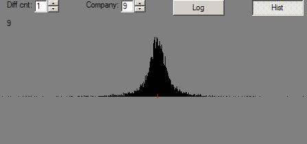
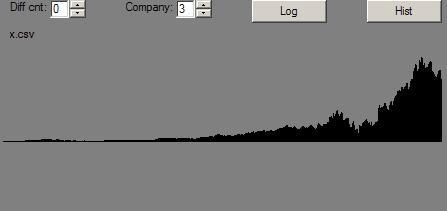
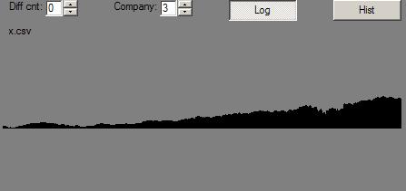
Let us, for instance, take an S&P 500 list of stocks (as of sometime late last year), and buy 15 of ’em at random a year ago. Then sell ’em today. Do that 100 times and tell us a distribution of the results:

From: 21-Apr-05
To:   21-Apr-06
Multiplier: 1.0
Percentile Distribution
 1   5.5   5.5
 2   9.7   9.7
 5  12.9  12.9
10  15.4  15.4
15  18.3  18.3
20  19.7  19.7
30  21.9  21.9
40  22.9  22.9
50  25.6  25.6
60  27.8  27.8
70  30.5  30.5
80  34.4  34.4
85  36.1  36.1
90  38.1  38.1
95  40.1  40.1
97  43.1  43.1
98  44.7  44.7
99  47.5  47.5

To explain: the line, “98 44.7 44.7” tells us how the portfolio in the 98th percentile did. It gained 44.7%. His equivalent on the dunce side gained 9.7%. And, the average portfolio was up around 25%.

There are two percentages printed. The first is the second multiplied by the “Multiplier” – a factor that makes the first percentage normalized for a 1-year period.

Well, that’s all real cool, execept that the real S&P 500 was up about 13-14% over the same year. So, what’s the deal?

I can think of two reasons for why dartboarding some stocks from the S&P list was better than buying an index fund:

  1. Survivalship bias. The stock list doesn’t include dogs that were in the list a year ago, but which were dropped because they died or floundered.
  2. Weighting. The S&P 500 average is weighted. So, perhaps the stocks with high weights did less well than those with low weights. The dartboard picks randomly, so it’s relatively skewed by better stocks.

And, maybe both of these factors were the cause of the results.

I ran the script over a period of time last year when the S&P 500 dropped. March 7 through April 28th of last year. (The script is told next-day dates.)

From: 8-Mar-05
To:   29-Apr-05
Multiplier: 7.02485966319
Percentile Distribution
 1 -86.6 -12.3
 2 -83.9 -11.9
 5 -76.7 -10.9
10 -70.5 -10.0
15 -68.2  -9.7
20 -65.3  -9.3
30 -60.6  -8.6
40 -57.8  -8.2
50 -52.7  -7.5
60 -48.3  -6.9
70 -41.8  -5.9
80 -37.6  -5.3
85 -32.7  -4.7
90 -29.7  -4.2
95 -25.8  -3.7
97 -24.7  -3.5
98 -21.3  -3.0
99 -12.9  -1.8

This is a closer match to the S&P 500’s average loss of the time, 6.7%, which is how a dartboard in the 6x percentile did. This helps the argument that dartboarding a market average has the effect of magnifying the swings. But, if that were so, then it seems like it would be possible to arbitrage the differences in volatility ‘tween a market average and a dartboard of the average. And, if that were the case, then that arbitrage opportunity would have long been taken (since it’s not exactly rocket science).

Anyway, here are the results from a run over a similar date period, but over which the real average was pretty much unchanged:

From: 3-Feb-05
To:   13-Apr-05
Multiplier: 5.29305135952
Percentile Distribution
 1 -22.9  -4.3
 2 -22.6  -4.3
 5 -19.1  -3.6
10 -16.9  -3.2
15  -8.6  -1.6
20  -6.6  -1.2
30  -3.0  -0.6
40  -0.2  -0.0
50   1.1   0.2
60   5.4   1.0
70   9.0   1.7
80  13.3   2.5
85  14.2   2.7
90  16.3   3.1
95  21.0   4.0
97  22.2   4.2
98  23.8   4.5
99  32.3   6.1

Just to give a gut feel for how accurate the numbers are, let’s run that script again:

From: 3-Feb-05
To:   13-Apr-05
Multiplier: 5.29305135952
Percentile Distribution
 1 -28.6%  -5.4%
 2 -28.2%  -5.3%
 5 -23.8%  -4.5%
10 -15.2%  -2.9%
15 -11.6%  -2.2%
20 -10.8%  -2.0%
30  -6.3%  -1.2%
40  -1.5%  -0.3%
50   2.8%   0.5%
60   5.0%   0.9%
70   8.4%   1.6%
80  11.7%   2.2%
85  16.5%   3.1%
90  21.2%   4.0%
95  22.8%   4.3%
97  27.1%   5.1%
98  27.4%   5.2%
99  32.2%   6.1%

OK. ‘Bout the same. So a hundred portforlios works ok over a fairly short period of time. Hmmm. Just for fun, let’s try 500 portfolios instead of 100:

From: 3-Feb-05
To:   13-Apr-05
Multiplier: 5.29305135952
Percentile Distribution
 1 -35.9%  -6.8%
 2 -27.3%  -5.2%
 5 -20.2%  -3.8%
10 -16.2%  -3.1%
15 -13.3%  -2.5%
20 -11.3%  -2.1%
30  -6.6%  -1.3%
40  -2.8%  -0.5%
50  -0.0%  -0.0%
60   4.0%   0.8%
70   8.0%   1.5%
80  11.7%   2.2%
85  14.6%   2.8%
90  18.1%   3.4%
95  23.4%   4.4%
97  25.4%   4.8%
98  27.5%   5.2%
99  33.1%   6.3%

Well, it might be a bit smoother and have better numbers out at the ends.

So, now let’s try 30 darts rather than 15 (you can see I’m improving the print-out with each run of this script):

From: 3-Feb-05
To:   13-Apr-05
Portfolio size: 15
Darts: 500
Multiplier: 5.29305135952
Percentile Distribution
 1 -30.6%  -5.8%
 2 -24.0%  -4.5%
 5 -20.4%  -3.8%
10 -16.0%  -3.0%
15 -13.3%  -2.5%
20  -9.8%  -1.8%
30  -6.6%  -1.2%
40  -2.9%  -0.6%
50   0.2%   0.0%
60   3.1%   0.6%
70   6.6%   1.2%
80  11.0%   2.1%
85  13.4%   2.5%
90  16.8%   3.2%
95  22.4%   4.2%
97  25.4%   4.8%
98  27.3%   5.2%
99  31.2%   5.9%

Which, as one might expect, pulls the extremes in a bit, but doesn’t change anything else, really.

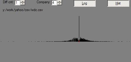
So, anyway, it would have been handy if I’d had a list of S&P stocks at the starting date. And, the historical data for each.

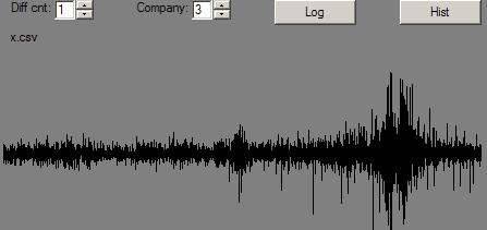
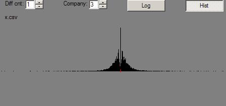
Off hand, I can’t think of a way to get portfolio_track.py to quickly print out what percentile of dartboard investors you’d be in. Since the width of the bell curve of those dartboarders is probably a function of the number of darts they throw, I guess that portfolio_track.py would simply need to use a formula that takes the number of stocks the real portfolio has in it.

Just to validate this thinking, here is another run with the dart count (the portfolio size) set to 400:

From:           6-Feb-06
To:             21-Apr-06
Portfolio size: 400
Darts:          500
Multiplier:     4.93521126761
Percentile 1-Year From-To Distribution
 1         21.8%    4.4%
 2         22.0%    4.5%
 5         22.5%    4.6%
10         22.9%    4.6%
15         23.2%    4.7%
20         23.5%    4.8%
30         23.9%    4.8%
40         24.3%    4.9%
50         24.6%    5.0%
60         24.9%    5.0%
70         25.2%    5.1%
80         25.6%    5.2%
85         25.8%    5.2%
90         26.1%    5.3%
95         26.7%    5.4%
97         27.0%    5.5%
98         27.1%    5.5%
99         27.3%    5.5%

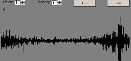
Anyway, I’ll run portfolio_track.py on the latest bunch of stocks I bought (which I haven’t felt particularly good about, and which weren’t bought in a single day, but we’ll ignore little dings which in this particular case make me look a hair better against the dartboard).

Symbol    1yrGain  Market-relative
---------------------------------------
ALDA        89.8%    70.1% ~ ^GSPC
BBBY        41.4%    22.8% ~ ^GSPC
EGY         66.6%    43.7% ~ ^GSPC
FORD        10.7%    -7.8% ~ ^GSPC
GTW        -61.7%   -80.2% ~ ^GSPC
JAKK       151.0%   132.5% ~ ^GSPC
KSWS       -16.6%   -35.1% ~ ^GSPC
MTEX       181.3%   162.8% ~ ^GSPC
OPTN        24.8%     6.3% ~ ^GSPC
WINS       -61.6%   -83.0% ~ ^GSPC
---------------------------------------
^GSPC       19.3%
---------------------------------------
Absolute:   42.0%
Relative:            22.7% ~ ^GSPC

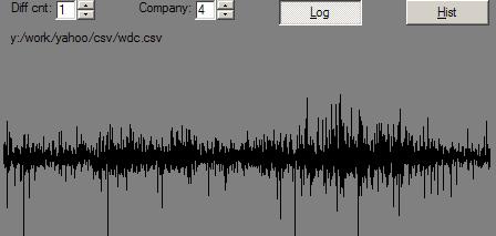
Well, now, the S&P went up pretty good during that time. Let’s dartboard it, roughly:

From: 6-Feb-06
To:   21-Apr-06
Portfolio size: 10
Darts: 2000
Multiplier: 4.93521126761
Percentile Distribution
 1 -20.1%  -4.1%
 2 -12.1%  -2.4%
 5  -1.6%  -0.3%
10   4.2%   0.9%
15   8.9%   1.8%
20  11.3%   2.3%
30  16.2%   3.3%
40  20.0%   4.1%
50  23.6%   4.8%
60  27.5%   5.6%
70  31.5%   6.4%
80  36.0%   7.3%
85  39.2%   7.9%
90  43.3%   8.8%
95  51.6%  10.5%
97  58.6%  11.9%
98  66.4%  13.4%
99  84.7%  17.2%

Apparently, to feel good, I gotta get deep in the 90’s. 🙂

Which gets in to another subject – can the scientific method be used internally between selves? In fact, is it? … ‘Nother time. …

All this wandering makes something rather clear: If you’re investing in a market average, you’re effectively saying:

  • you believe you are somewhere under the 50th to 60th percentile of investers (assuming that the difference ‘tween results of a 50 percentile investor and a 60 is not worth the effort).
  • you don’t know where you stand in the percentiles – and want to assume that you’re as likely to be on the bottom as on the top.
  • you figure that you are all over the map, depending upon time and circumstance
  • there is no percentile ranking of investors. Everyone is the same.

Let’s assume that there is a ranking. How do you find your current position?

If picking stocks took no time and transactions were free, then it would make sense to dartboard a boatload of stocks (say 1 share each). Then, if you find yourself above the 60th percentile, start exchanging the stocks you most dislike for the ones you most like. Do that until you drop significantly in the rankings. That’s when you’ve reached your Peter-Principle level of incompetence.

Alternative that doesn’t require infinite time and free transactions: Buy a few shares of one stock and a lot of a market average “stock”. When you go above the 60th percentile with your picked stock(s), sell the market-average and buy a picked stock. Hill-climb the results of your total portfolio as you would using the previous method.

The hill-climb method you would use, by the way, seems to be identical to a method you would use to trim a boat with no tell-tales or instruments while sailing up-wind in shifting winds.

Describing Stock Price Histories

How could stock price histories be described?

Well, one thing that graphs of relative price history show is that their changes are “hairy”. Lots of zeros and lots of quick up/downs. It’s like there is energy stored up, and when it releases, there are sudden jerks. And one jerk leads to another.

Rather like two pieces of rusted metal trying to slide along each other. Do continental plates make the same kind of noise? Would they if they were on a infinite, flat-plane planet? For that matter, isn’t a sphere a good physical model to use for self-referential systems?

Do the jumps represent “the market” correcting an out-of-kilter situation? If so, then that would imply that there is an information bottleneck. When the backed up information is released, the market responds quickly…. implying that the market can respond faster than information is being made available. What would things look like if the market were inherently slower to process available information than the rate that such information is made available? Lost information – or, if the two rates were, over time, roughly equal … queuing stuff.

Or, are these changes caused by bad information that is constantly being updated, rightly or wrongly?

Or, is the market simply being noisy in the absense of information – effectively bouncing between widely separated walls that represent what information is actually available? Imagine that the true value of a stock is between 30 and 35. There is no way to know where inside that range it is, though. Wouldn’t the best market behavior be to bounce against both 30 and 35?

Is there a “true value” of a company?

This all sounds like technical analysis stuff. Without any predictive power.

Mountainous Times

Here is a mountain range’s profile:

Fractal Mountain Profile

Or, if you prefer, displayed on a sorta biased log scale:

Fractal Mountain Profile


The mountain range is generated using a relatively standard fractal mountain range method:

  1. Starting with the whole range as a segment, divide the segment in half and move the middle of it up or down randomly from where it would be if it were on a line ‘tween one end of the segment and the other.
  2. Recursively do the two half-segments.
  3. But … pick smaller and smaller random movements as the segments get smaller.

And, here’s WDC’s (Western Digital) daily price history, similarly displayed:

WDC daily price profile

And, on a log scale:

WDC daily price profile

WDC’s price history is nice to work with because it is not very swamped by market movements.

Now, what do relative daily changes look like for both:

Mountain range:

Fractal Mountain Changes

WDC:

WDC Changes

Here are the histograms of the changes:

WDC Changes Histogram

Fractal Mountain Changes Histogram

By contrast, here are the same pictures for MMM (3M) after its price has had the Dow Jones Industrail Average (of which it is a part) factored out:

MMM Minus Dow Jones Daily Prices

MMM Minus Dow Jones Daily Prices

MMM Minus Dow Jones Changes

MMM Minus Dow Jones Changes Histogram

And, here are the pictures for the Dow Jone Industrials, themselves:

Dow Jones Daily Prices

Dow Jones Daily Prices

Dow Jones Changes

Dow Jones Changes Histogram

So, aside from lots of pictures, what’s up?

Well, one thing that sure stood out: Relative changes went in to overdrive in the mountain range where there were valleys. Not nearly so for stocks.

That’s not news, but I’m asking myself some questions:

  1. Does the method I used for making the mountain range make bad mountains? There are notes on the net that suggest that the method I used is not really “correct”. Anyway, they sure look like mountains.
  2. Which way is it with real mountains?
  3. Is the eye normally fooled by mountain range profiles that have, in effect, oversized boulders in the valleys?
  4. Or, is the eye fooled in to thinking that an oversized-bumps-in-valleys profile is that of a reasonable mountain range?
  5. What about the ear? Nose? Etc?

Anyway, this particular difference ‘tween fractal mountains and stock prices is probably at least one reason why Mandlebrot turned to multi-fractals to try to generate values that look like stock price histories.

One thing I may fool around with: modulating the random up/down-ness of mid-points not by the size of the segment, but by another mountain range. That’s kind of working backward, as the next thing to do would be to modulate the modulator … and so on. Or, put another way, does the profile of the uncertainty of “the market” with respect to a stock look like a mountain range? And so on.

Anyway, again, this is getting a bit off the track. One good thing: if a simulation’s operations are underlain by intrinsic values that are mountain range data, and if the simulation creates stock-history-like data, then that’s a good thing. Presumably, pieces of the simulation’s logic can be turned on and off and it can be found which bits of logic are critical and which are not. Which is the idea.

Odd thing

I got curious whether stock price behavior might be a consequence of some combination of buyers and sellers who had access to different information. Naturally, that sounds like a job for a simulation. Simulations are always easier than thinking. 🙂 And, they are sure better to learn with.

Anyway, somehow that got me looking at real stock market prices (thank you, Yahoo closing price history downloads). If I’m gonna simulate stock pricing, then it would be nice to know what the real thing looks like.

So far:

1) I pinged an email address on a web page to find out about available tools to detect whether artificial stock pricing looks like the real thing. Bust. He said his stuff was just some numbers he didn’t know about. The web site was about fractal stuff – including Mandlebrot’s stock market work.

2) When I graphed the histogram of relative changes to closing prices for some stocks and market averages, the older stocks had a curious oddity in them looking like this:

Histogram of relative changes to MMM daily closing price over many years

Note the crater at the center.

The crater seems to be caused by a combination of:

1) The numbers I’m using are normalized for stock splits – so old closing prices can be really small.

2) The numbers are rounded to the penny.

3) Before a few years ago, the smallest change in a price was a 1/16th (or 1/8th?) of a buck. If the resolution of the histogram is much smaller than that amount, then all the changes under 8 cents get rounded to zero – and are included in the tall spike at zero.

Anyway, I messed around, explicitely not using multifractals and variable time. And got some numbers that, when graphed in various ways aren’t too different looking from real stocks.

Time to press on and leave this distraction.

Ah. One thing thinking about a simulation does: It makes real clear what is pointed out (but often buried) in available information: The basis of value of all stocks is dividends. And, the ideal thing is to buy a stock when it’s worth pennies, and get a decent dividend when the stock is worth a lot. If you buy a stock for a buck and it goes to $100 and pays a 4% dividend, then you’re getting a pretty good payback on your buck even though the stock goes back to zero value in the end – which you want it to do from that $100 in a single day, of course. 🙂

Anyway, my plan is to create a bunch of stocks with a real value (dividends) profile that look like that mountain range. Then give some actors differing knowledge and/or disinformation of the future and let ’em go at it in a market.

And see what happens.

Fractal Stock Market

It might be an interesting experiment to match stock price histories againt the profiles of fractal mountain ranges.

… thinking that in its beginning the value of a company is zero – sea level. And, in the end … 🙂

This image doesn’t help you much if you’re the person travelling across the continent, though. You still don’t know what’s over the next hill. And, unlike real terrain, you can’t look ahead over valleys (low prices) to see the hills – or ocean – beyond.

But, it’s a nice image.

Stock Portfolio

Just talked with Eric about stocks and random walks and thinking machines and split wing politics.

And, about a little script, portfolio_track.py, I whipped up to expose how a bunch of stocks were doing against “the market”. With the the quantities removed, we have:


Symbol 1yrGain  Market-relative
------------------------------------
AEOS     20.9%     5.0% ~ ^GSPC
ALDA     74.3%     6.5% ~ ^GSPC
ATYT    101.0%    97.3% ~ ^GSPC
AV      -32.0%   -41.7% ~ ^GSPC
BBBY    -41.5%   -98.1% ~ ^GSPC
BC      -22.3%   -30.7% ~ ^GSPC
BSX     -23.2%   -34.1% ~ ^GSPC
DOW     -14.5%   -24.2% ~ ^GSPC
EEM      78.4%    61.9% ~ ^GSPC
EGY     -45.4%  -124.1% ~ ^GSPC
EWY      15.7%    -0.8% ~ ^GSPC
FLEX    -34.6%   -45.5% ~ ^GSPC
FORD    -59.2%  -107.1% ~ ^GSPC
GM       96.3%    70.3% ~ ^GSPC
GTW       0.0%   -47.9% ~ ^GSPC
HD        2.5%    -7.2% ~ ^GSPC
JAKK    468.1%   420.2% ~ ^GSPC
KSWS   -193.0%  -240.9% ~ ^GSPC
LXK     -33.5%   -47.8% ~ ^GSPC
MMM       4.1%    -4.9% ~ ^GSPC
MRK      13.1%     6.0% ~ ^GSPC
MTEX    -77.2%  -125.1% ~ ^GSPC
NTGR     98.7%    99.3% ~ ^GSPC    -
OPTN     89.8%    42.0% ~ ^GSPC
OVTI     86.2%    76.3% ~ ^GSPC
PCAR     -4.0%   -12.9% ~ ^GSPC
PCL      -9.7%   -19.4% ~ ^GSPC
PLMD     58.3%    42.5% ~ ^GSPC
PLT      76.9%    61.1% ~ ^GSPC
PXR      52.7%    36.9% ~ ^GSPC
SWK      10.1%     0.3% ~ ^GSPC
TBL      53.9%    44.1% ~ ^GSPC
TDW     127.1%   108.3% ~ ^GSPC
USG     173.3%   166.7% ~ ^GSPC
VBR      42.9%    26.3% ~ ^GSPC
WDC     401.3%   385.7% ~ ^GSPC
WFR     149.8%   139.0% ~ ^GSPC
WINS    -32.4%   -99.5% ~ ^GSPC
X        91.0%    80.1% ~ ^GSPC
------------------------------------
^GSPC    12.0%
------------------------------------
Absolute 52.4%
Relative          40.4% ~ ^GSPC

which, bottom line, means that, as of this moment, I’m a stock market genius. Check back in a week or two when the most recently bought stocks, all but one of which are doing badly, really start to clock in.

There are two possibilities here:

1) My luck is good.

2) I don’t know how to keep doing well. Picking these stocks is not a reproducable process.

BTW, I don’t have some of the stocks listed above any more. Sold a few for various – arrgghh – short term capital gains ’cause they really seemed to be ready to go away. But, checking just now shows that I’m not a genius after all. All but one are up now from their sell price. Oh well.

To explain the script output columns:

Symbol – Add it to http://finance.yahoo.com/q?s= and you’re good to go.

1yrGain – Gain or loss, as a percentage of the money, normalized to 1 year. E.g. If a stock were held for a half year and has gained 20% during that time, then the number in this column would be 40%. Eric points out that this number can be really, really misleading. A stock that is held for 1 week for a 1% gain would have a 52% value in this column. Really looks good. But isn’t a big money maker.

Market-relative – Gain above the market in 1-year-ness. In other words, this is the gain above what the same amount invested in some market average – in this case S&P 500 – would have been.

Absolute: Raw, 1-year-ness gain overall. This is what most people look at. I don’t consider it interesting, as it’s gotta be considered relative to just sitting back and holding some market tracking “stock” or “fund” or whatever.

Relative: Overall portfolio gain relative to the “market” index in 1-year-ness terms.

Interestingly, the only stock held during a period of market loss in this list is NetGear, NTGR. The S&P 500 hasn’t been all that hot this past year. Up 12% for the weighted times that I’ve had stocks in this portfolio isn’t bad, but it’s surprising that it hasn’t dropped a bit during more than one of the periods reflected by each of these holdings.

These numbers above don’t include dividends and trading costs. If trading costs were included, the bottom line numbers would probably go down a couple percent each. Dividends might bring the numbers right back up, though, as several of these stocks pay out well.

WARNING to self: The script is pretty untested. I’ve reason to believe that it’s not correct. Too, that is uses end-of-previous-day prices for the “market” is inherently inaccurate, given that most of my trades come at the beginning of the day. Anyway, one thing I’ve learned doing this stock market stuff is that single-digit changes one way or the other are noise. One could argue that larger changes can be noise, too. Consider Google’s run-up. That might be called “crowd noise.”