… is any instance of the word, “alcohol“.
What would people who experienced the Eastern Hemispheric flood of the Western Hemisphere have made of this omission?
https://archive.org/details/GunsGermsSteel2017/page/n1/mode/2up/search/alcohol

… is any instance of the word, “alcohol“.
What would people who experienced the Eastern Hemispheric flood of the Western Hemisphere have made of this omission?
https://archive.org/details/GunsGermsSteel2017/page/n1/mode/2up/search/alcohol
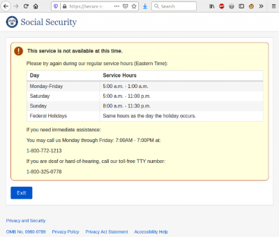
Apparently, mySocialSecurity’s web server works the modern equivalent of “banker’s hours.”
Culture-tied snippets from old media are fun and informative.
Consider the ad in which “nine out of ten doctors prefer Camels.”
Most old movies are filled with such oddities from customs of the day.
For real fun, look for pairs of things that only make sense paired together in today’s culture. Tomorrow, culture will change. But laugh today.
That all said, I give you a recent screen capture from the south east corner of an Ars Technica page:
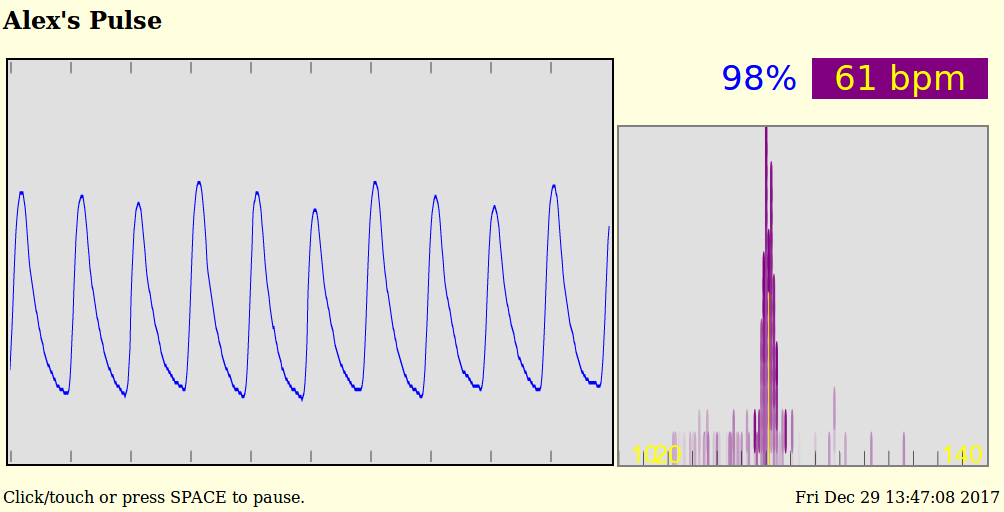
Over the last few months I’ve had reason to watch my heartbeat using information from a CMS-50D Pulse Oxi device. When all is normal, a display from a web app I’ve written to show the Pulse Oxi’s output shows something like this:
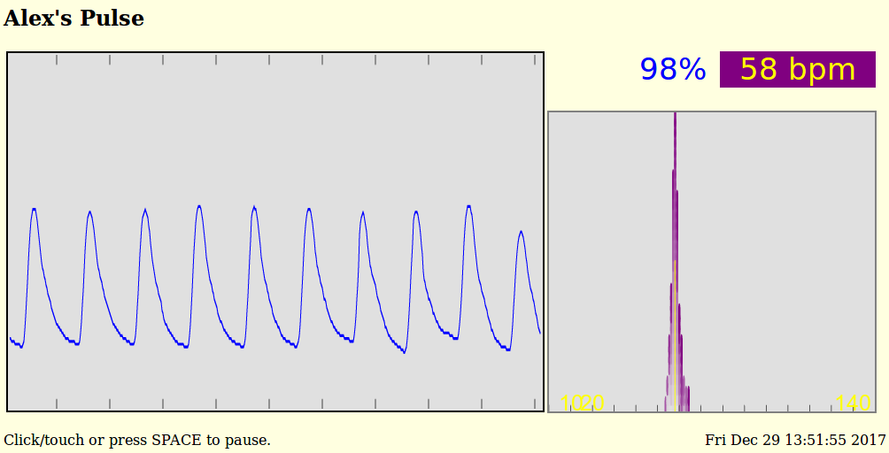
All well and good.
But, currently, if I put my heart under a bit of load, it doesn’t just speed up as it should. Instead, it does something like this:
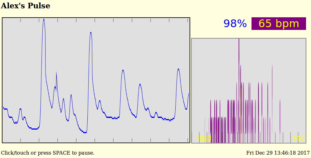
OK. What is “this”?
“This” is the pattern of 1 over-sized beat followed by 3 to 5 fast, weak beats followed by a delay of a beat of so. This is an unpleasant, very breathless pattern.
The thing is, this pattern isn’t all that’s going on. And, it raises the question, “What about a longer view?” The waveform display shows about 10 seconds of heartbeat. That’s great for general use, but you need to watch the display carefully to see trends and changes that happen over 10’s of seconds, let alone minutes.
A normal waveform display is also unsatisfactory in another way: The beats-per-minute number lags. In practice, BPM displays tend to be averages over 15 or more seconds. Fine for when all is well, but easily misleading when not.
So, examine the smaller graph in each of those two screen shots.
It shows a histogram of the last 120 peak-to-peak durations in beats per minute. Both the low and high peaks are counted, so this histogram shows the last 60 heart beats. The first graph above shows each half-beat has been plus or minus 5 or so BPM of the average heart rate. Normal.
Histogram details:
Tall lines show where many peak-to-peak durations have been at a single heart rate.
Short lines show heart beats of rarely seen durations.
Each peak-to-peak half-beat in the histogram is given a short line segment. Fully colored segments are recent beats. Faded segments are older beats. Segments are stacked in each beat-per-minute “bin”, oldest first, to make the histogram.
Ticks are painted at 10 BPM intervals along the bottom.
The yellow line marks the current, average heart rate. It is usually close to the tallest area of the histogram.
The second graph above shows when the heart does not beat consistently – misses or adds beats.
This histogram says, “Look carefully at this heart.”
Over time, you can watch a heart go in and out of sync. And it’s fun to watch the heart speed up and slow down, what with the columns marching back and forth on the histogram.
Here is a screen shot of when the heart beat was bad, but is now looking good:
Anyway, it’s been amusing to play with this stuff. And such a FIFO histogram could certainly be used in other applications.
A real-time display of either my current heart beat or a random, historical recording is at Alex’s Pulse – if the special, heartbeat server is running … which it rarely is, given the bandwidth this server consumes.
Have you ever wondered what driving in Lesotho is like?
Me neither.
But now I can say, without having been there, it’s a lot like the altiplano.
You know the altiplano. Well above tree level and not a thing to see after the first glance. But curiously entrancing. People live at this altitude? Well, with lots of thick wool and really red blood … apparently.
Or go a little north to Botswana. Mad Max country. The Australian out-outback. English on the wrong side of the road and miles a miles of … miles and miles.
Dropped to these places by spaceship without knowing where you are? How do you find yourself?
In Holland, such questions are answered immediately. The Dutch apparently even label their bus stops with unique names, available for decoding 24×7 through Google’s super-computer. As are the names of little Estonian villages, in case the spaceship dropped you there.
The spaceship is at MapCrunch
Click on “Options” and check “Stealth”. Then make sure all the countries are either highlighted or none of them are. Toggle “Options” off. Punch “Go”. Welcome to somewhere in the world’s farmland as shown in Google’s Street View.
Right now, click maps.google.com and click on the street view thingee down in the lower right. It toggles showing where street view covers. Zoom a bit in and you’ll see where the real coverage is. Germany, Austria, India, and China have only isolated 360° images. They are not street-viewed.
Apparently, a popular MapCrunch challenge is to get from your drop point to an airport for a flight home. No outside help. No Googling. No other Internet tools. Just drive and look. I can advise you not to accept this challenge. Airports are few and far between and driving even 30 miles is really, really slow and RSI inducing (make the window small for fast refreshes). Maybe it would be better to just drive to somewhere you can get some food. Restaurant or store or whatever.
I binged for several days on an alternate game: Figure out exactly where you are using outside help. This game can still be slow. You can open the real Google Maps Street View in another window and find the location you’re at by matching the cloud pattern in the sky. Desperate times call for desperate measures. When you’re cruising south on some road in scrub-land Bolivia, not a town in sight, you gotta do something.
http://www.lexilogos.com/keyboard/russian_conversion.htm is very helpful when you’re in Cyrillic-land and don’t have a Cyrillic keyboard.
You’ll want Flag Finder for when you just arrive and see a rural police station’s flag.
Which way to go at the start? Down hill.
Is the sun north or south? You’re below or above the equator. If it’s to the west, consider driving the same direction as the Google car. He’s headed home for the day.
Satellite dishes point to the sky above the equator.
Driving on the left narrows things down.
The script in signs can peg the country. Korean is easy to spot, for instance.
Signs may be in indecipherable script, but URLs are on those signs. URLs have country codes.
You may even find LAT/LON values on signs. My little LAT/LON interpreter is handy to get to those locations.
Mileposts are give-aways. They have the highway number and, usually, a kilometer-to-some-town/bridge/landmark on them. Go to the direction of the lowest kilometer number when first orienting.
After a while, some things stand out:
New roads. New houses. New factories (P&G in countryside Romania). All over the world.
Cell phone towers everywhere.
Contrasts: Bleak, bedraggled Bulgaria and Kyrgyzstan. Sunny Albania. Thriving Slovakia and Serbia.
Deep red dirt of Uganda.
Frosted Polish trees.
Rebar sticking out of Latin American buildings.
Concrete of the tropics.
Pristine Scandinavian buildings. Red.
Road signs with weirdly chosen destinations. Why is that town on this sign?
Highway numbers that make little sense. But are still able to be found in a Maps window overlooking the country.
Many, many one lane roads, indistinguishable from American bike trails.
If your body has some miles on the odometer, play this game: Erase cell phones and scale the car quality back. What year in America are you looking at? Countryside Panama in 2010 looked like the ’50’s to me.
Ignore country-specific things like languages, zoning laws and building style. Notice the big differences you see between places in the world are rural/urban, not country/country. Cities look the same everywhere. Same stores. Same brands. Same way things are built. Houses are built for the climate and culture. American houses are surrounded by toy farms, for instance. We call them “lawns”. Other places have their oddities. Walls around the house, for instance, are common.
Notice you can’t peg a location by the highway, itself. Yes, guard rails and such do vary, but the road engineers of the world seem to be in close contact. New roads are especially generic. I was sure I’d hit Nevada when I dropped in on a desert highway in Botswana. It took a couple trucks going by (“Anderson Trucking”) before I noticed they were on the wrong side of the road. … The road, whose lines and signs were clearly ‘merican.
In case you think it’s just a couple of odd, Brit holdovers who drive on the left, what with #1 and #3, China and US being right-siders, consider #2 and #4, India and Indonesia on the left.
Final advice: Don’t binge on this thing. After a 34 hour session, I slept fitfully with more than a little pain and porcelain throne facing for 22 hours. And then wrote this advice.
Racquetball’s official scoring method is a millstone around the game’s neck.
What’s better?
Let’s score to make games more even, with longer rallies.
How?
First: Rally scoring. A point is scored on every rally, not just when the server wins a rally. Volleyball went to rally scoring a couple decades ago. Big improvement.
Second: Who serves? The person with the lower score chooses. If the score is even, the person who did not have the serve-choice the previous serve chooses the server.
Third: Single serve. A fault is a point for the opponent. (I prefer two serves in racquetball, but that’s probably not the best way to do it. Most probably not the best in other sports.)
Fourth: The serve rotates in team games, doubles, etc., when the serve-choice changes. And the serve-choice side can force a single rotation of the serving side at any other time.
Fifth: Game is to 15 – win by two.
The result: Short, competitive games between players of differing skills. Longer rallies because the weaker player starts more rallies with an edge.
Bonus: Faster games. More action in a match. More fun to play. More fun to watch.
Applies to other games: Volleyball, ping-pong, badminton, squash. You name it.
Racquetball is inherently fast and action-packed. Why should it have a plodding scoring system? Why not a system that fits the game?
Which leads to how games will change when judging and ref’ing become automated. Why should points only be counted once a rally? But that’s another subject for another day.
I go to Facebook every few days, weeks or whatever. Kids’ pics. Volleyball happenings. Doings of people I’ve known over the years.
What’s happened to my follow-feed, though, is people I know to be fine people in real life appear in the feed as the girl on the left:

This is disheartening at best.
Politics is entertaining, but, golly, let’s not scream at our favorite character on TV when they do something dumb. Get a grip.
But, of course, the other guy will never get a grip.
So, for Firefox, there’s Grease Monkey and my quick and dirty Grease Monkey script, FaceBookFix.user.js, to the rescue.
This script simply takes Facebook posts off screen if they contain, in text form (sadly not in images), any of a list of words.
It’s not heavily tested, to say the least. Which is to say, I tried it a couple times.
I made it easy to add or delete banned words. Non-programmers can change the script if they can find it on their disk and save it as a text file from WordPad or a better text editor.
The results are nice. My feed is now pleasant. Again. “Never do yourself what a computer can do for you,” so the computer now lets me see the real news un-flooded by noise. (If this post makes it to Facebook, I can’t write “f*** news” or the script will make the post invisible to me!)
Oh. Here’s the whole script as of this moment:
// ==UserScript==
// @name        FaceBookFix
// @namespace   https://www.tranzoa.net/~alex
// @description Get rid of sad Facebook tantrums.    https://www.tranzoa.net/alex/public_stuff/FaceBookFix.user.js
// @include     https://www.facebook.com/
// @version     1
// @grant       none
// ==/UserScript==

/***

    FaceBook posts containing any of these listed strings are whacked.

    The strings are in in no particular order.

    Change as you see fit.

    Non-programmers, leave the last one as the last one.

    Non-programers, for syntax reasons, do not put any:
        single-quote         ( ' )
        pipe/vertical_stroke ( | )
        backslash            ( \ )
    characters in any of the strings.

***/
var find_these_strings  = [
    'killary',
    'drumpf',
    'obozo',
    'shillary',
    'repuglican',
    'democrap',
    'libtard',
    'faux news',
    'hilliary',         // I forget other Internet commenters' alternate spellings. More to come, for sure.
    'trump',
    'hillary',
    'clinton',
    'HRC',
    'DJT',
    'obama',
    'biden',
    'pence',
    'nixon',
    'watergate',
    'reagan',
    'steve bannon',
    'stevebannon',
    'bernie sanders',
    'berniesanders',
    'bernie',           // Sorry about this, Bernie-from-Dimas-days. Your brand has been trashed.
    'sanders',
    'george bush',      // 'bush' is just too generic
    'georgebush',
    ' g bush',
    ' gbush',
    ' gw bush',
    ' gwbush',
    ' h bush',
    ' hbush',
    ' hw bush',         // did I get these bushes right?
    ' hwbush',
    'kkk',              // why are Hollywood and the news guys obsessed with the KKK? No one in the real world cares about them.
    'mcconnell',        // maybe this should be only mitch McConnell
    'sean spicer',
    'seanspicer',
    'harry reid',
    'harryreid',
    'paul ryan',
    'paulryan',
    'muslim',
    'impeach',
    'senate',
    'house of rep',
    'parliment',
    'merkel',
    'abortion',
    'pro-life',
    'prolife',
    'pro-choice',
    'prochoice',
    'occupy democrats',
    'occupy wall',
    'fake news',
    'iran',
    'iraq',
    'isreal',
    'saudia arabia',
    'potus',
    'scotus',
    'executive order',
    'daily show',       // ? poeple seem to feel this show is really important when it discusses politics
    'fuck',             // the whole profanity list should be here.
    'shit',
    'Note: Leave this here at the end of the list.'
    ];
find_these_strings  = find_these_strings.join('|').toLowerCase().split('|');
find_these_strings.pop();       // get rid of the comment at the end


(function (){

function    fix_this_facebook_thing()
{
    var divs = document.getElementsByTagName("div");                            //  Find all DIV elements in the page
    // window.console.log("fixing " + Date.now() + " " + divs.length);
    for (var el_number in divs)                                                 //  Python is *so* superior to JavaScript
    {
        var el  = divs[el_number];
        if ((el.id != undefined) && el.id.startsWith('hyperfeed_story_id_'))    //  For each post in the feed
        {
            var htm = el.innerHTML.toLowerCase();                               //  Look for any of the strings without regard to case
            // window.console.log("scanning " + el.id + " " + htm.length);
            for (string_number in find_these_strings)
            {
                var fs  = find_these_strings[string_number];                    //      For each of the strings to find
                if  (htm.indexOf(fs) >= 0)                                      //          Is the string in the post in text form? (sadly missing them in images and videos)
                {
                    el.style.display    = 'none';                               //          Yes. Take the post off screen
                    // window.console.log("whacked: " + fs + " in " + el.id);
                    break;                                                      //          And don't keep looking in the this post for more matches.
                }
            }
        }
    }
}


var timeout_every_couple_seconds = window.setInterval(fix_this_facebook_thing, 2017);


}());


// eof
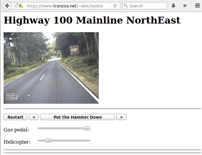
WSDot has always been out in front with cool and useful things. And data. And such.
This evening I found http://srview.wsdot.wa.gov/srweb/srweb.htm. Sort of a poor man’s Google Street view. Except, in one way, it was superior to GSV: Driving.
So, I made it easier to drive. Now, if only this sort of thing were available worldwide.
Twenty some years ago my right hand became frozen around a mouse. It took the left hand to pry the mouse from my … hand.
Why?
Microsoft Minesweeper.
Too much Minesweeper.
So, on the principle of “Never do yourself what a machine can do for you.“, I wrote a program to play the game. On screen. Mouse clicks and all.
And after watching expert mode being solved in 7 seconds a few times under Win 3.1, Minesweeper became boring and I stopped playing it. (No. The program did not use the cheat mode. It played fair.)
Problem solved.
Fast forward some years.
I wrote a program to solve Spider.
It didn’t help. I’ve still spent too much time on that game. But the program did find only a couple of impossible-to-win games out of 32 thousand dealt. That was informative.
Fast forward some more years.
I wrote a Sudoku program to stop myself from playing that game, uncompelling and bite sized though the game was. It was a fun program and is handy to find impossible and incompletely initialized / ambiguous games (e.g. at sudoku.com). But it didn’t satisfy.
Fast forward to now.
And we have a screen shot from sudo_ku.py playing a game at www.WebSudoku.com :

We’ll see if I keep playing this site’s game.
Or a hacked old Python Gnome Sudoku program:

The program looks at the screen(s), finds boards, solves them, and plays them using mouse clicks and keys to enter the numbers. Though the program is incomplete, it’s pretty satisfying. Perhaps that’s why at one point many years ago I said that my job was to automate my job. And perhaps that’s why I’m not among the robotic hand-wringers of today. It’s simply fun to watch machines do what they do best.
Finding things wrong with the US medical system is like dynamiting fish in a barrel.
Finding ideas for improvements isn’t any harder.
Implementing such ideas or even simply validating whether they are good ideas is much, much harder.
But one day I stood back and considered the “system” while keeping in mind three little phrases.
1) Who cares? It’s not my money.
2) You get what you pay for.
3) First, do no harm.
There may be other phrases as pithy and relevant. I don’t know. Can you think of any?
Let’s flesh these phrases out:
Medical expenses are disconnected between payer and payee. Given regulatory realities, if you want to control your own medical expenses, you need a competing system – in another country.
But, going to another country is not often an option. US medical expenses are dominated by Medicare/Medicaid. Medicare/Medicaid don’t pay foreign medical bills.
When you are insulated from the price of medical care, your are not the customer. You are the product, perhaps. The raw material, perhaps. But you are not the customer.
Imagine buying something from Mr. Someone without knowing the price until your bank account has been debited for that Wells Fargo money order you sent to Mr. Someone. Ah, you would be the “mark”, perhaps, but not the customer.
We all deeply know that “cheap” is cheap and “expensive” is high quality.
When you are sick or broken, do you want a cheap fix? Gosh no! You want the best money can buy. Since you have no clue what particular fix you want, it’s safest to go with the expensive fix and hope for the best.
Just try to justify a cheap fix for someone else’s body. Don’t you look horrid? Yes, you do, you uncaring cheapskate.
So, the existing medical system is a cost maximizing system. By demand.
Medical practice is not perfect. Many diseases and other negative attributes of our bodies are not dealt with well at all. This will always be true.
So how does the “system” find cures or fixes?
Carefully. By “hill climbing”.
“Hill climbing” is a simple, universal search method. When hill climbing, you start from where you are and look around your neighborhood for a better place to be. You go to that place and do the same thing again. And again. And again. Until you find yourself in the best place in your neighborhood. You have found what you are looking for. Search complete.
For example, imagine looking for a cure for cancer.
You have a current therapy for cancer. But is there a better one?
Well, you *could* search for one by randomly trying all sorts of things:
* Homeopathic beets.
* Up-beat music.
* Vegetarian fish.
* And so on.
But, “First, do no harm.” Ignoring the current, best therapy can certainly qualify as doing harm. So, to find a better therapy, you modify the current, best therapy by just a very little. Usually, you add something to the current best therapy – an extra “medicine”. Just enough to check a similar, nearby therapy. Carefully. Then, if this new therapy is an improvement, you switch to it, and do the process again. Carefully.
As a strategy, hill climbing can work very well. Unless the possibilities are vast or the best therapies don’t have wide, easily found slopes leading up to them.
Hill climbing gets stuck on what are called “local maxima” – the best place in the vicinity. Not the best place. Only the best place near the searcher’s current location.
Hill climbing is not a good way to find breakthroughs. Breakthroughs happen when someone gives up on current practice and flies off on a tangent. Doing harm.
Consider ants when they know their food source. They file to and fro, slightly improving the path to the source by cutting corners until the path is short and easy. They do no harm.
When the path is broken, the ants wander around in a peculiar random way, casting about for some indication of food.
They can die wandering randomly. “Tough break, Mr. Ant. Hard times call for hard measures. You do yourself harm for the greater good.”
Uh, huh. Sell that to Hippocrates and his oath.
So there you have it. Food for thought.